

More Than a Mask
Postage Stamp Series | Digital Illustration
2022
Adobe Illustrator
This stamp series explores the layered identities of four iconic cinematic villains – Darth Vader, the Joker, Catwoman, and Maleficent – characters often reduced to their roles as antagonists but who, upon closer inspection, reveal depth, conflict, and even moments of redemption. The title More Than a Mask speaks to the emotional duality behind their facades – the pain, vulnerability, and humanity that exist beneath their dark exteriors. This piece merges graphic design with storytelling, reimagining villainy through a lens of empathy and nuance – delivered in a format traditionally reserved for national celebration and legacy.
Visual Direction
The visual direction began with research into the cultural impact and character development of iconic film villains who embody moral complexity. I focused on Anakin Skywalker, the Joker, Catwoman, and Maleficent – characters known not just for their darkness, but for their internal conflict and moments of redemption. This informed the decision to portray each figure with a stylized yet emotionally expressive vector illustration.
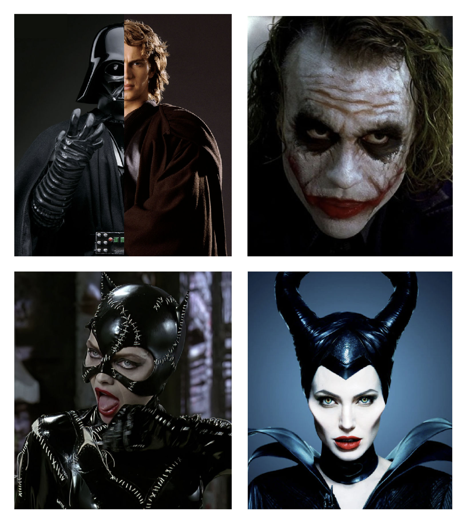
Digital Explorations
In the early stages, I explored a split portrait of Anakin Skywalker and Darth Vader to highlight his transformation and inner conflict. While the concept was compelling on its own, it quickly became clear that it didn’t work cohesively within the series. I wasn’t able to create similar split identities for the other villains, which made the piece feel inconsistent and out of place. Visually, it stuck out rather than contributing to a unified narrative. This led me to revise the design to focus solely on Darth Vader, using color and expression to convey his duality in a way that aligned with the rest of the set.

Fine Tuning
In the final phase, I refined the color palette to improve contrast and clarity. The original deep red and blue gradients overwhelmed the illustrations, causing them to appear muted and visually heavy. By shifting to lighter gradient tones, the portraits gained more definition and vibrancy, allowing the characters’ expressions and details to stand out. This adjustment helped unify the series and enhanced the emotional impact of each design.

The Reveal
In the final designs, I incorporated typographic choices and personal touches to elevate the visual narrative. A serif typeface was used for the title “Iconic American Entertainers” to give the stamps a classic, official feel. Along the bottom left, I used a script typeface for “forever” to mimic the style of traditional postage stamps. To further individualize each piece, I included the actual signatures of each character, adding a subtle yet meaningful layer of authenticity and character recognition. These details brought cohesion and a refined finish to the overall series.


