Save The Manatee Club
Multipack Concept | Digital
2024
Adobe Illustrator, Adobe Photoshop
Save the Manatee Club is an award-winning national nonprofit 501(c)(3) and membership-based organization established in 1981 by the late renowned singer-songwriter, author, and entrepreneur Jimmy Buffett, and former U.S. Senator Bob Graham when he was governor of Florida. Save the Manatee Club’s mission is to protect manatees and their aquatic habitat for future generations. This is my design concept for new packaging created through coursework.
www.savethemanatee.org
Scratch That
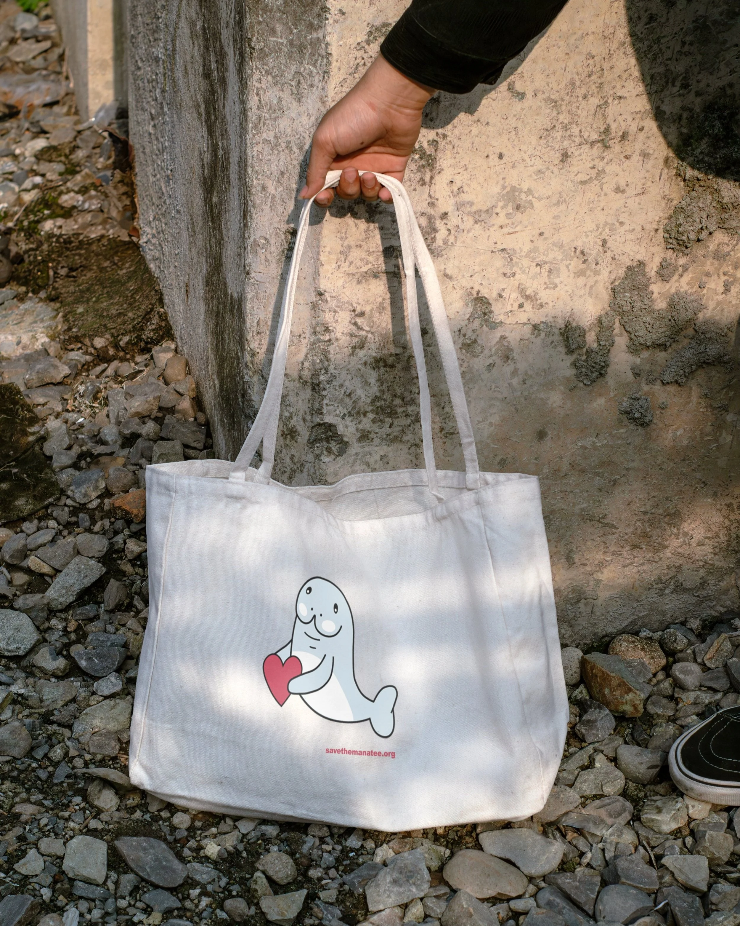
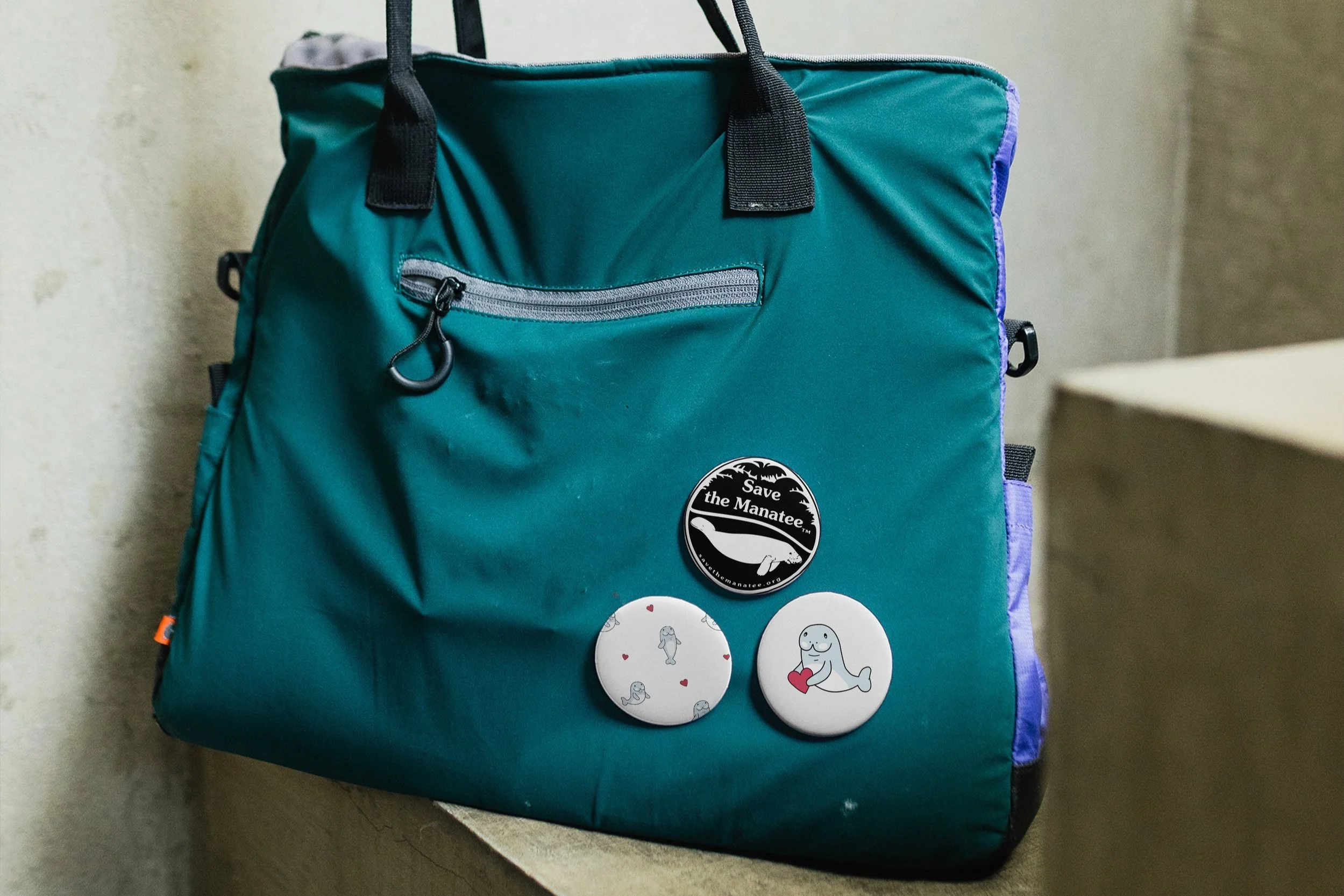
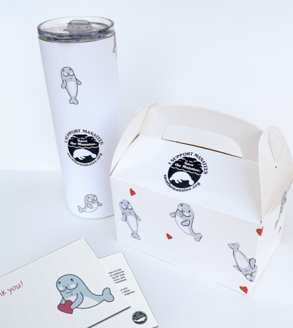
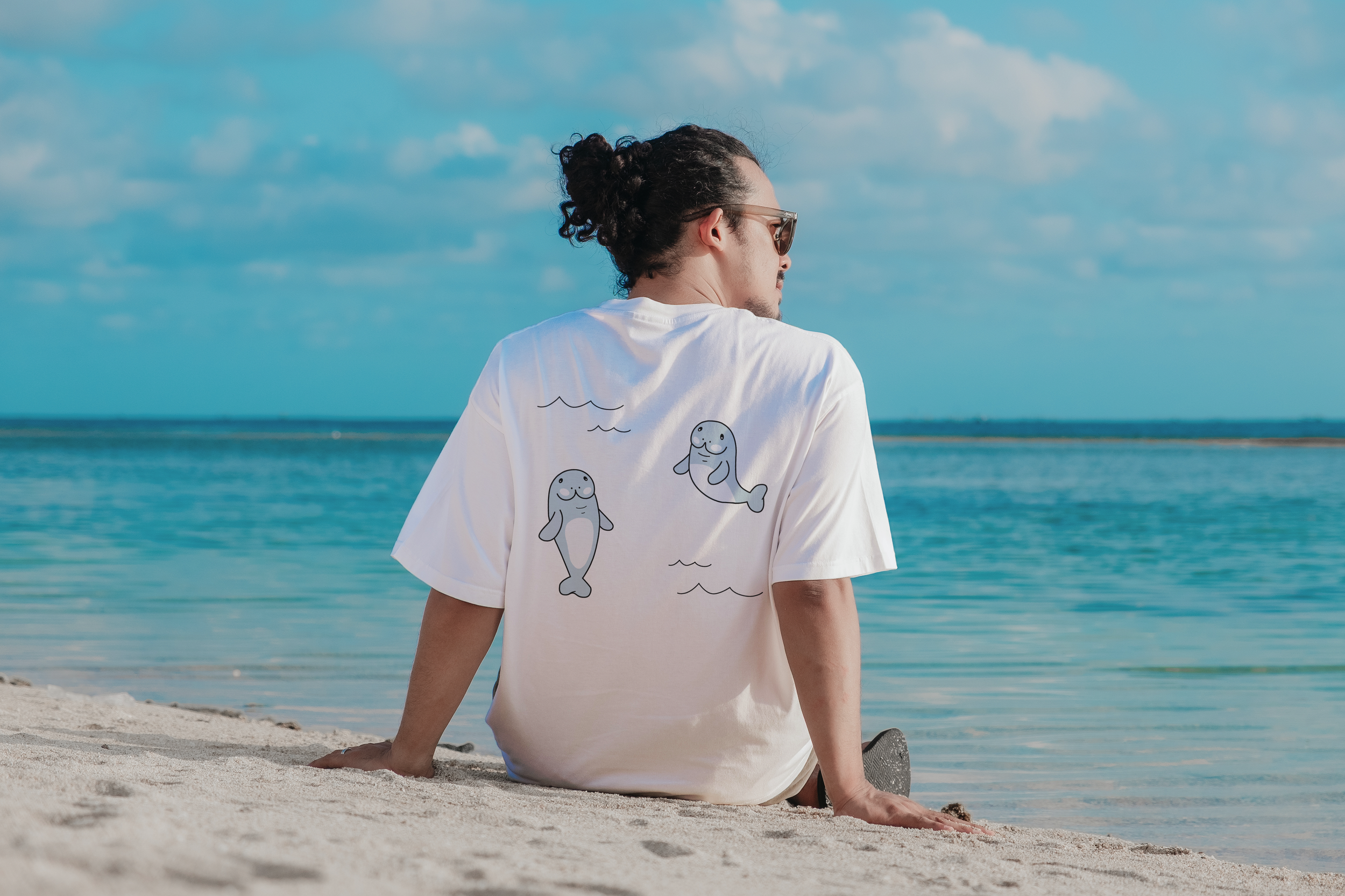
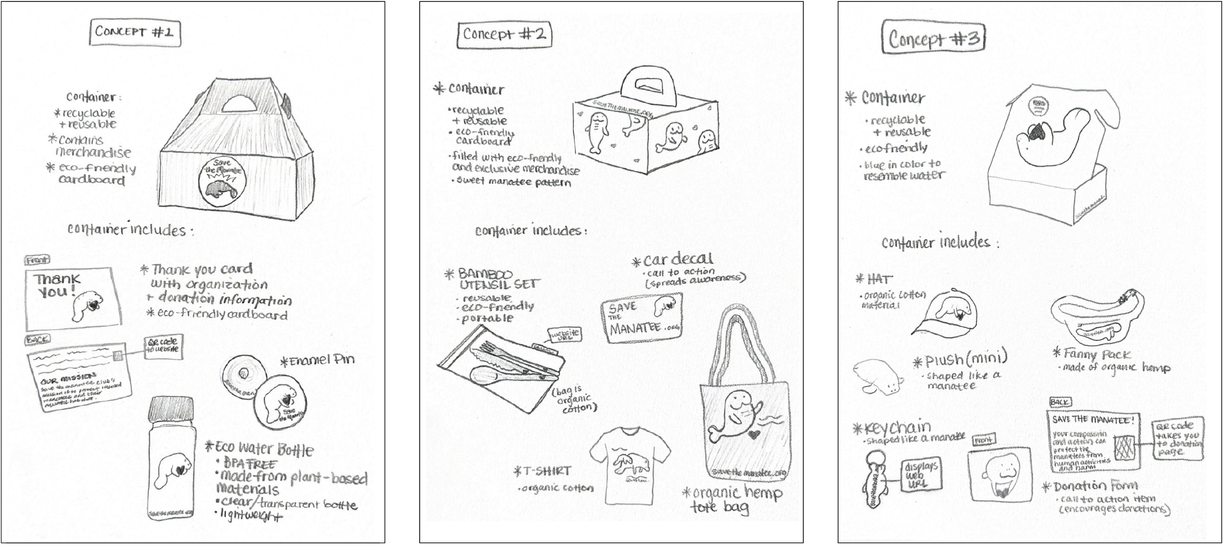
My concept sketches explored three distinct multipack options, each designed with sustainability and supporter engagement in mind. The first pack includes a container, enamel pin, eco-friendly water bottle, and a thank-you card, with each being simple and impactful. The second is more practical, featuring a container, bamboo utensil set, car decal, recycled cotton t-shirt, and organic hemp tote. The third leans playful, with a container, hat, mini plush, organic hemp fanny pack, keychain, and donation card. All items use sustainable materials, aligning with the Save the Manatee Club’s mission. For the final design, I selected a thoughtful mix of items from all three packs to create a balanced, engaging supporter experience.
The Letter Lab
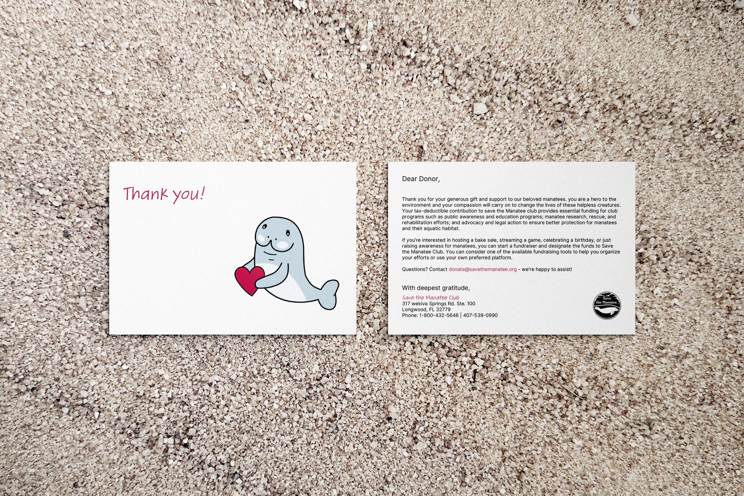
I chose typography that balances clarity with warmth. Arial Bold was selected as the primary typeface for its strong readability and straightforward appearance, ideal for a wide, intergenerational audience. To add a more personal, heartfelt tone to the donation thank-you cards, I incorporated the Adobe Handwriting typeface in Tiffany, which brings a handwritten feel without sacrificing legibility. These choices support the nonprofit’s mission by prioritizing accessibility, simplicity, and emotional connection.

Hue Hunt
The color palette for the Save the Manatee Club multipack was designed to reflect both clarity and compassion. While black and white provide a strong foundation for readability and accessibility, I incorporated a soft, muted blue to evoke calmness, water, and the gentle nature of manatees. A desaturated red adds warmth and emotional resonance without feeling overly bold or aggressive. Together, these colors support the vision of the multipack – balancing simplicity with a caring, approachable tone that aligns with the nonprofit’s mission.

Midpoint Milestones
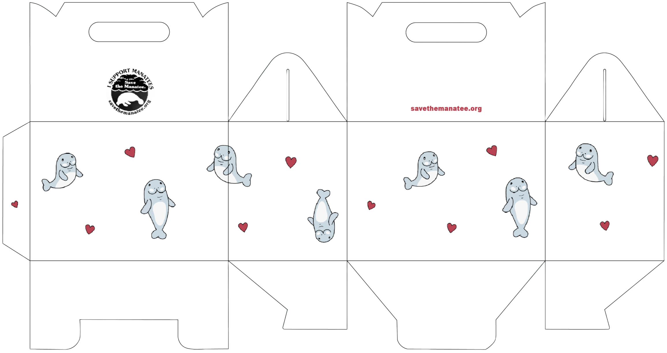
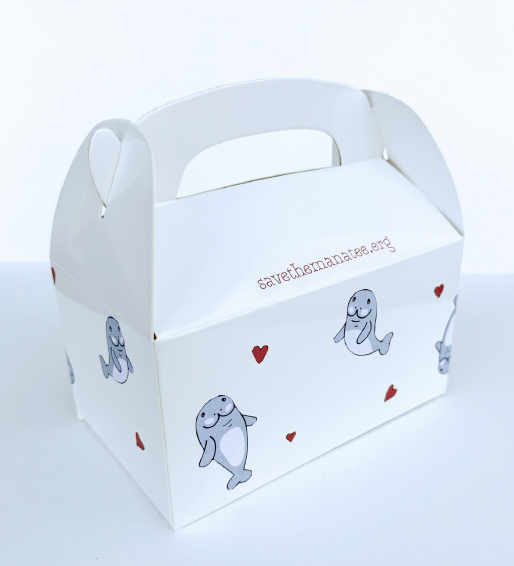
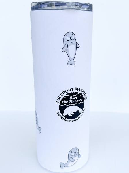
To bring a playful and heartfelt tone to the Save the Manatee Club multipack, I created custom vector illustrations featuring light blue and white manatees with soft, rounded forms. Scattered red hearts add a cheerful, pattern-like element that enhances the visual appeal, especially for print applications. I also incorporated thin, wavy lines to certain components to subtly represent ocean currents, tying the illustrations back to the manatees' natural habitat. These elements work together to create a warm, friendly visual language that supports the organization’s mission in an accessible and memorable way.
Completed Vision
The completed vision for the Save the Manatee Club multipack brings together thoughtful design elements to create a cohesive, accessible, and heartfelt package. From custom vector illustrations to a clean, friendly color palette and approachable typography, every detail supports the nonprofit’s mission of education and conservation. The multipack is designed to resonate with a wide audience, feeling both personal and professional, while making supporters feel appreciated and connected to the cause.
Environmental Contact