True Tone Swim
Rebrand Concept | Digital
2023
Adobe Illustrator, Adobe Photoshop, Adobe InDesign
I rebranded True Tone Swim, a company specializing in tan-through swimsuits and bikinis, to better reflect its unique identity and appeal. The original branding felt flat and disconnected from the vibrant, sun-soaked experience the product offers. My redesign introduces a more bold, beachy aesthetic that’s eye-catching and authentic, capturing the freedom, fun, and confidence that defines the brand’s promise of seamless sun and swim.


The Current Branding
True Tone Swim’s current branding features a minimal, clean logo with simple typography and a neutral color palette. The overall look leans toward understated and functional, with an emphasis on simplicity. While the design supports a modern aesthetic, it leaves space for future development in expressing the brand’s personality and unique product offering: swimwear made from innovative, tan-through fabric.
The Rebrand
The refined digital logo designs for True Tone Swim build on earlier concepts with increased clarity, cohesion, and brand personality. The curvy, ocean-inspired type is more balanced and intentional. The supporting sans-serif typography provides a clean contrast, reinforcing the brand’s minimalist sophistication. The teal accent color is used more strategically, and subtle textures add depth without overpowering the design. These refinements move the logo closer to a final concept that feels both fresh and aligned with True Tone Swim’s identity.

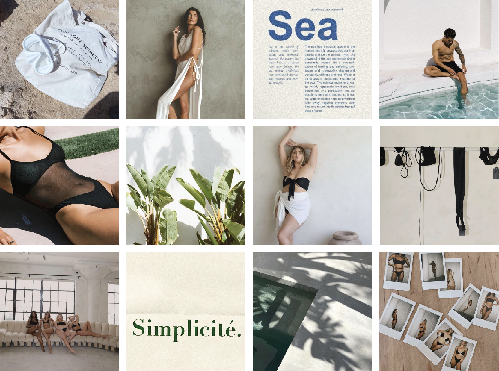
Vibe Check
As a first step in the rebranding process, I created a mood board using curated imagery from True Tone Swim’s website and social media. This visual exploration helped identify key gaps in the brand’s current identity and laid the foundation for a more vibrant, cohesive look. The new direction embraces a lively, sun-drenched aesthetic that better communicates the brand’s unique tan-through technology and carefree beach lifestyle.
The Doodle Phase
The initial logo sketches focused on developing a stronger, more distinctive brand identity for True Tone Swim. The goal was to move away from their existing logo, which felt bland, somewhat generic, and posed potential readability issues. My sketches explored ways to infuse more personality, clarity, and beach-inspired energy into the mark, setting the foundation for a refreshed identity that better reflects the brand’s unique tan-through fabric and bold aesthetic.

Typographic Voice
The typography for the new True Tone Swim logo blends personality with refinement. To reflect the fluidity and movement of the sea, I chose a groovy, curvy typeface that brings a sense of rhythm and playfulness to the brand. This is paired with a light, clean sans-serif typeface to maintain balance and echo the brand’s existing minimal and sophisticated tone. Together, the two type styles create a dynamic yet cohesive visual identity that feels fresh and fashion-forward.


Pigment Picks
The color palette for True Tone Swim introduces a refreshing update while staying grounded in simplicity. A vibrant splash of coastal teal brings in a cool, coastal energy that evokes the feeling of ocean waves and sunny escapes. This accent color adds life and movement to the brand, while the continued use of black and white maintains a clean, minimal foundation. Together, the palette strikes a balance between bold and sophisticated, capturing both the playful spirit of swimwear and the modern edge of the brand.

Building the Framework
The first digital drafts of the new True Tone Swim logo introduce a fresh sense of energy and personality to the brand. The slight splash of color adds vibrancy and ties into a coastal, sun-soaked aesthetic, while the continued use of black and white maintains balance and versatility. Added texture brings depth and character to the designs, helping the brand feel more dynamic and expressive. These two initial logo concepts lay the groundwork for a refined visual identity and serve as the starting point for the final direction.


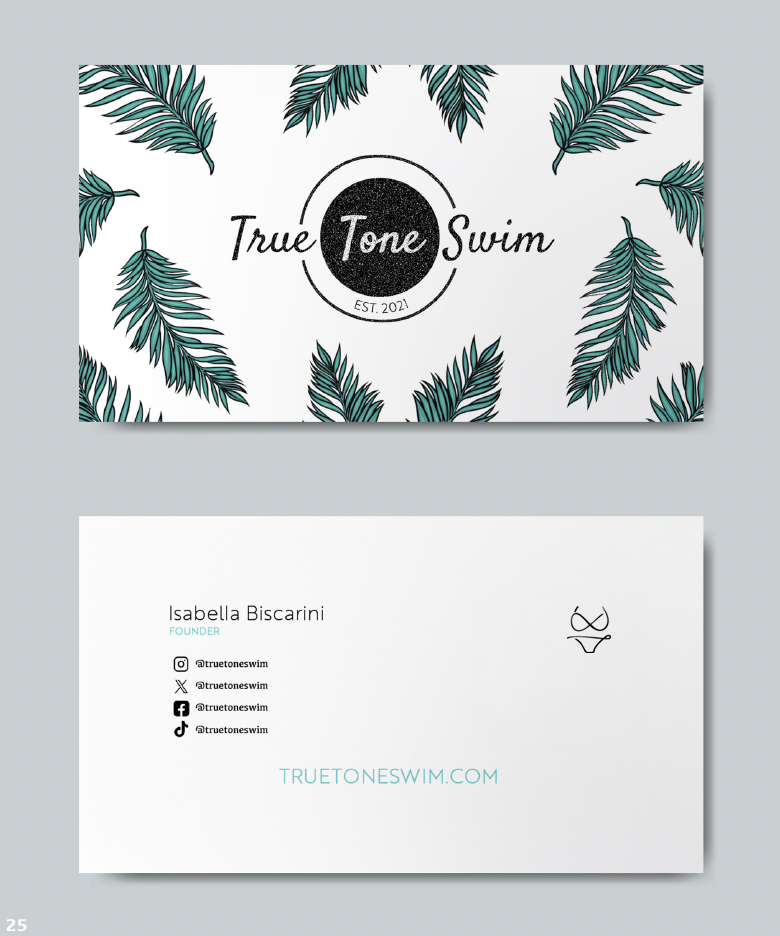
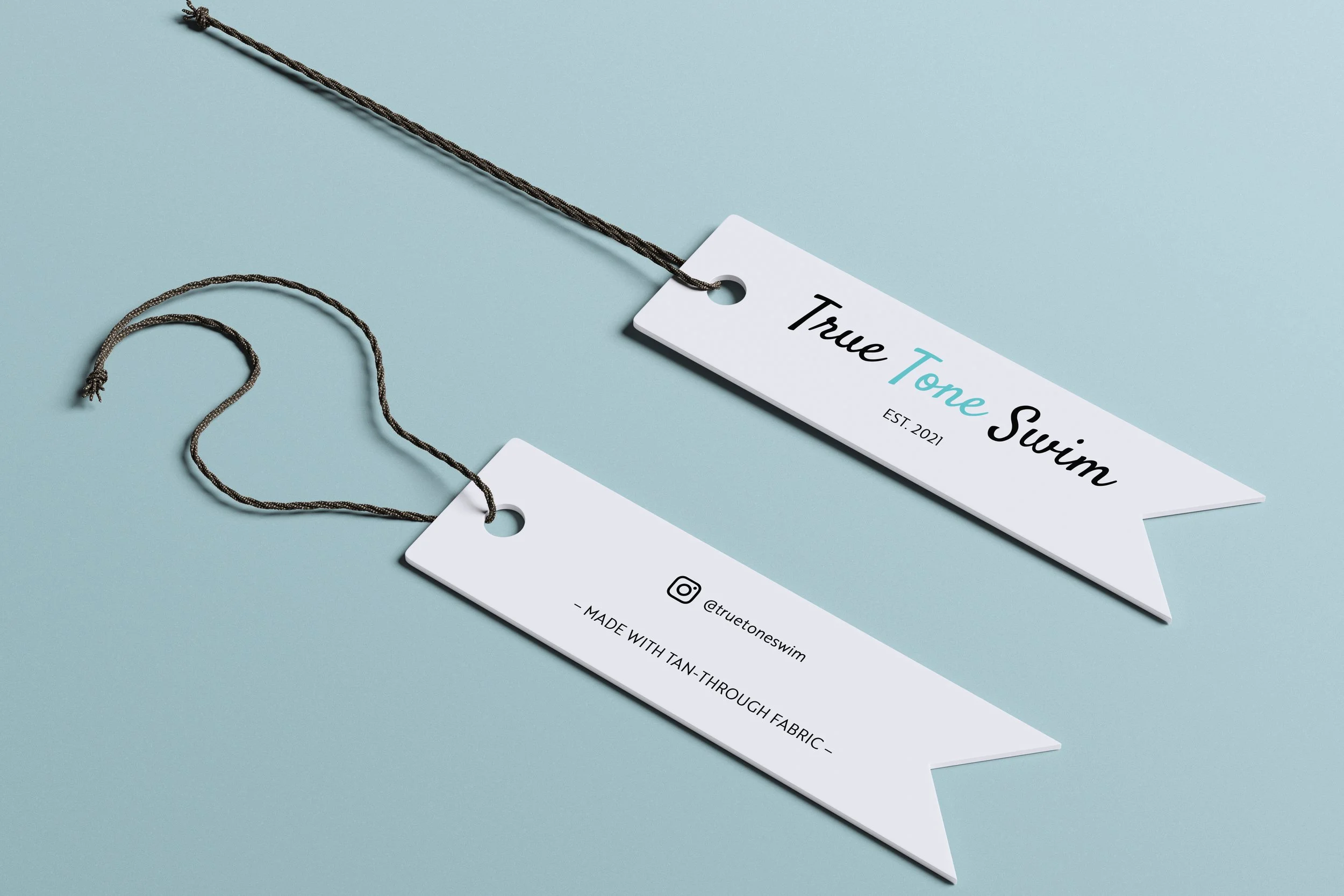
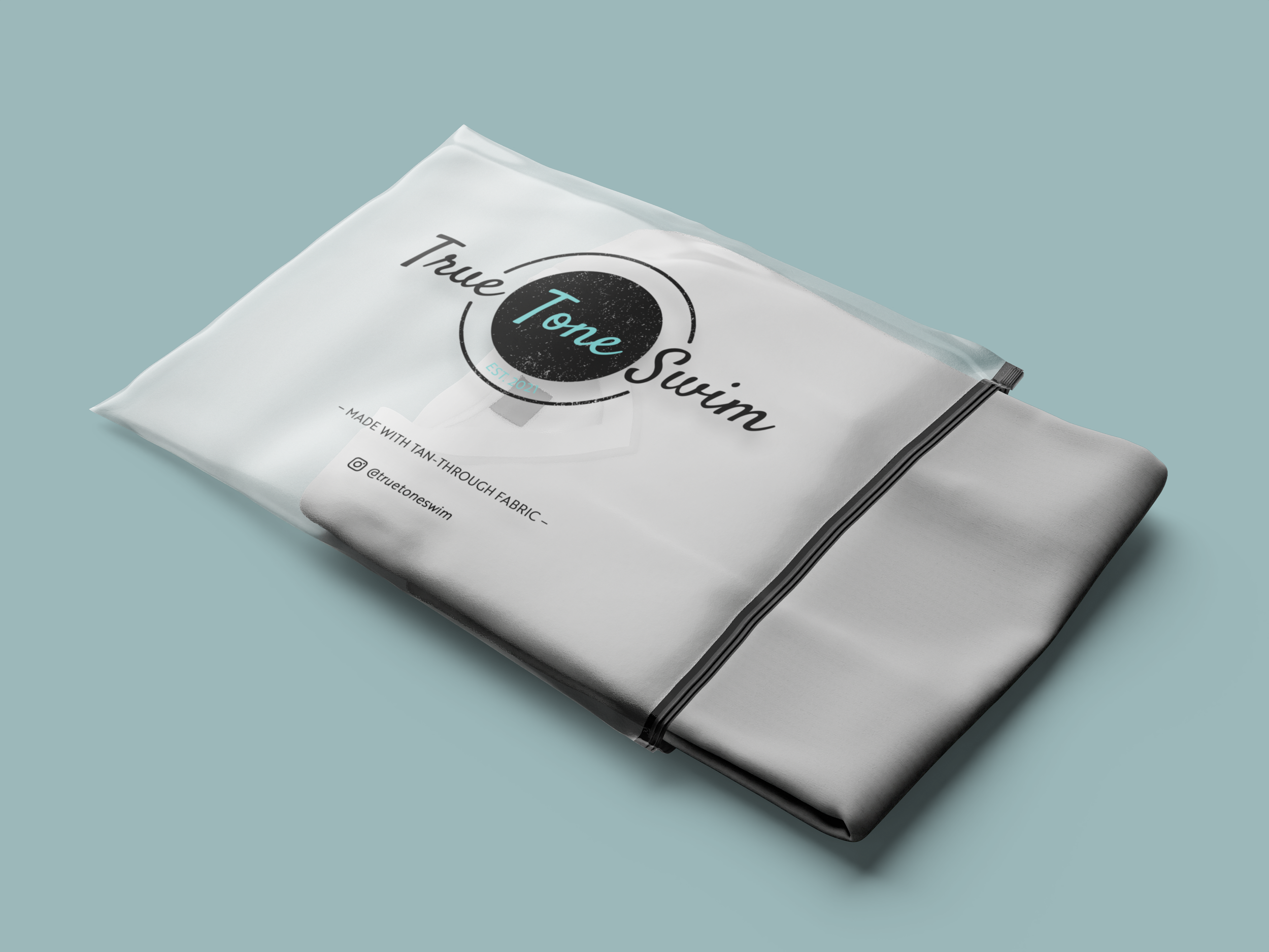
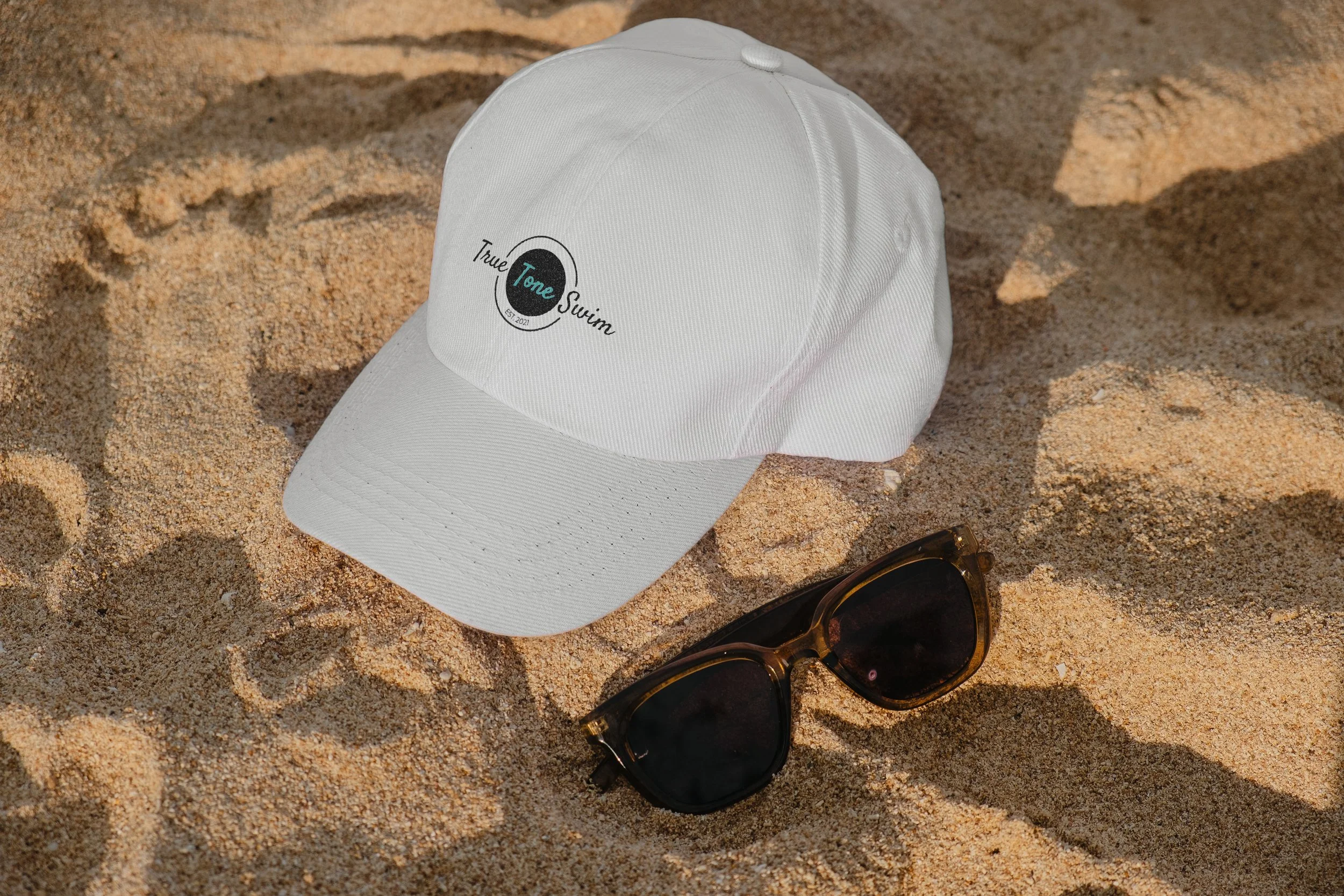
The Extras
To ensure flexibility across various applications, I developed additional logo variations for the True Tone Swim brand. One version uses a white colorway, designed specifically for use on darker backgrounds or imagery. Another is a simple black-and-white version for clean, minimal presentation. The third variation features only the words “True Tone Swim” in the new typeface, removing other visual elements to create a streamlined option ideal for print components or subtle branding moments. Each variation maintains consistency while adapting to different design needs.
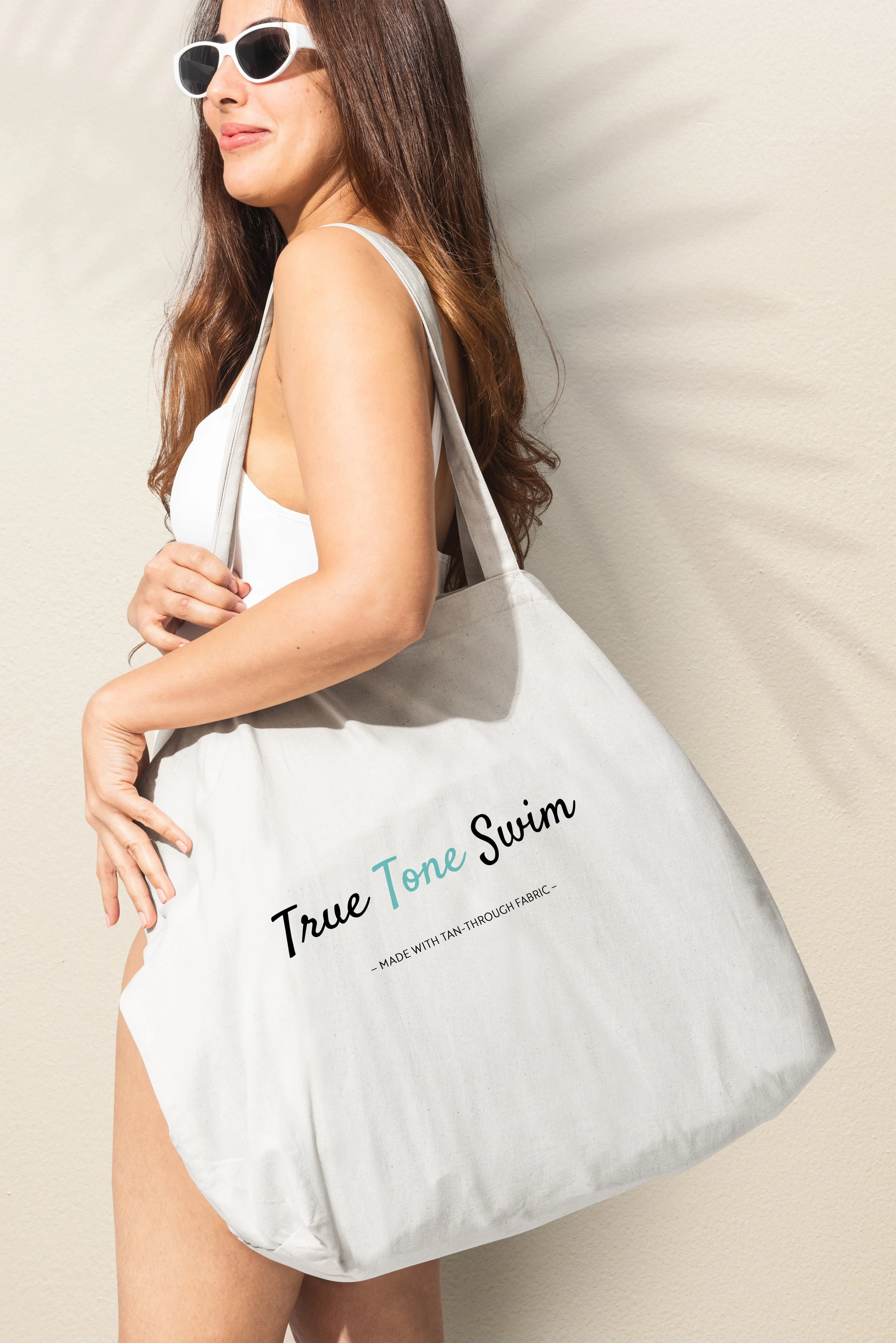
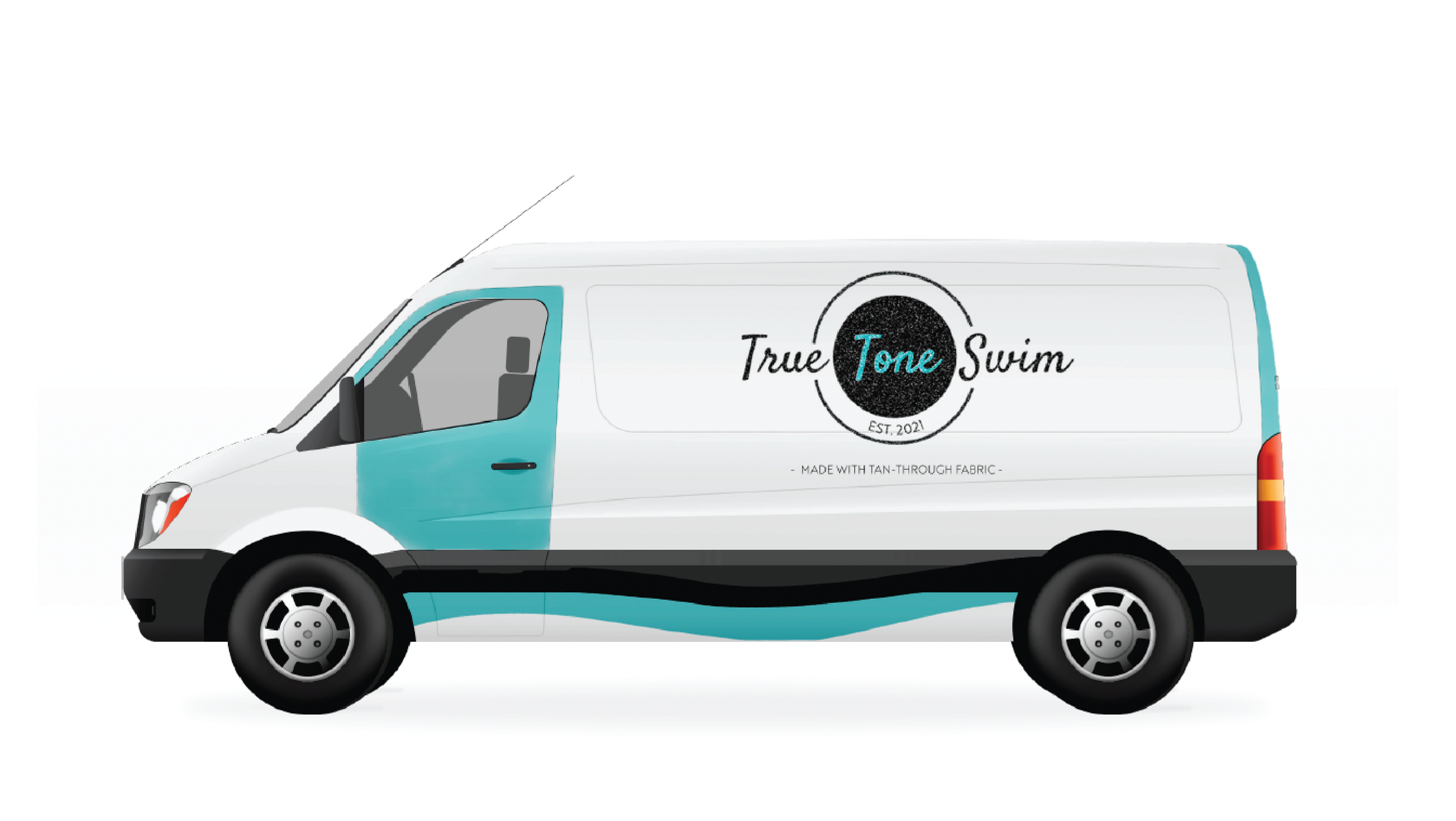
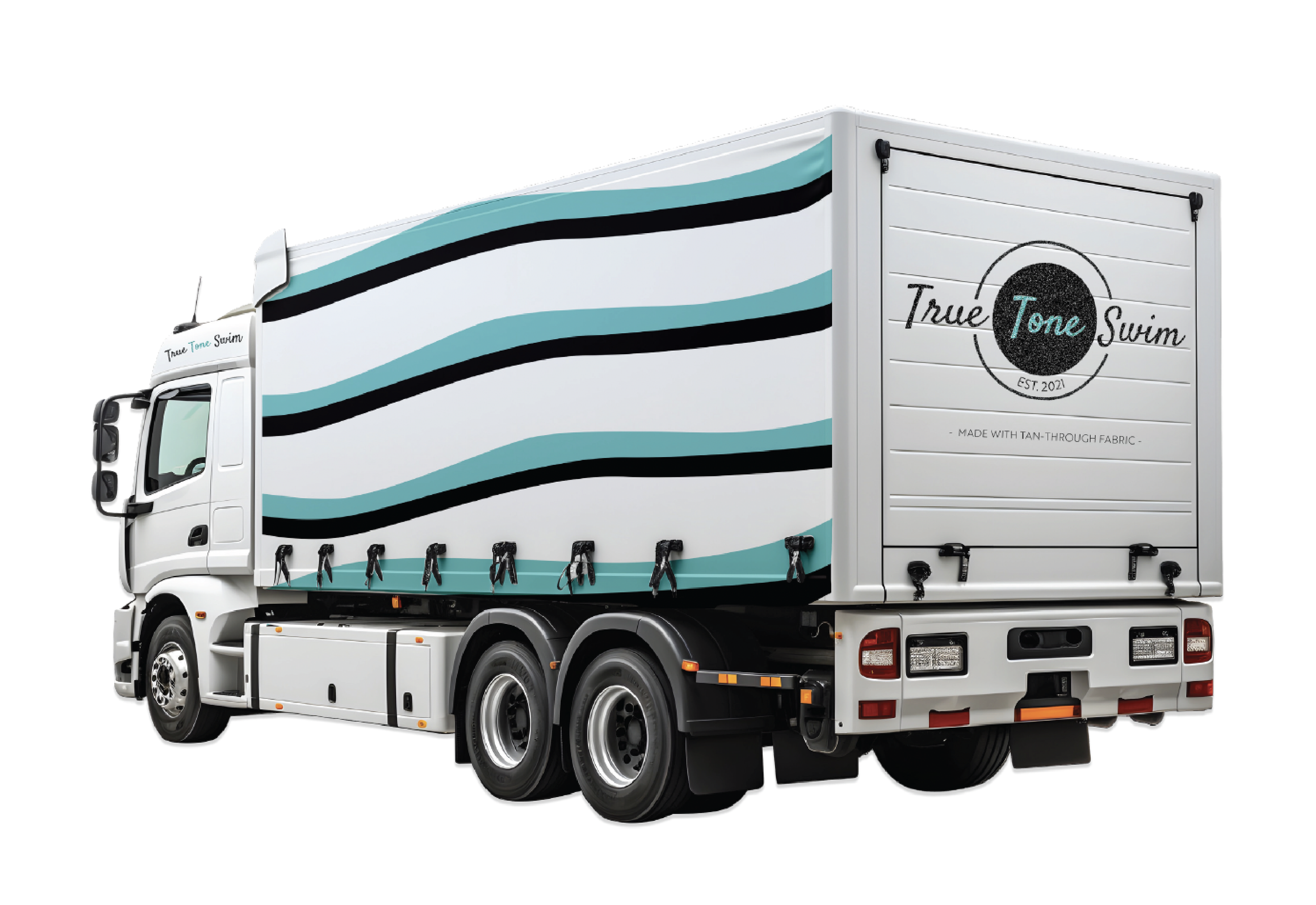
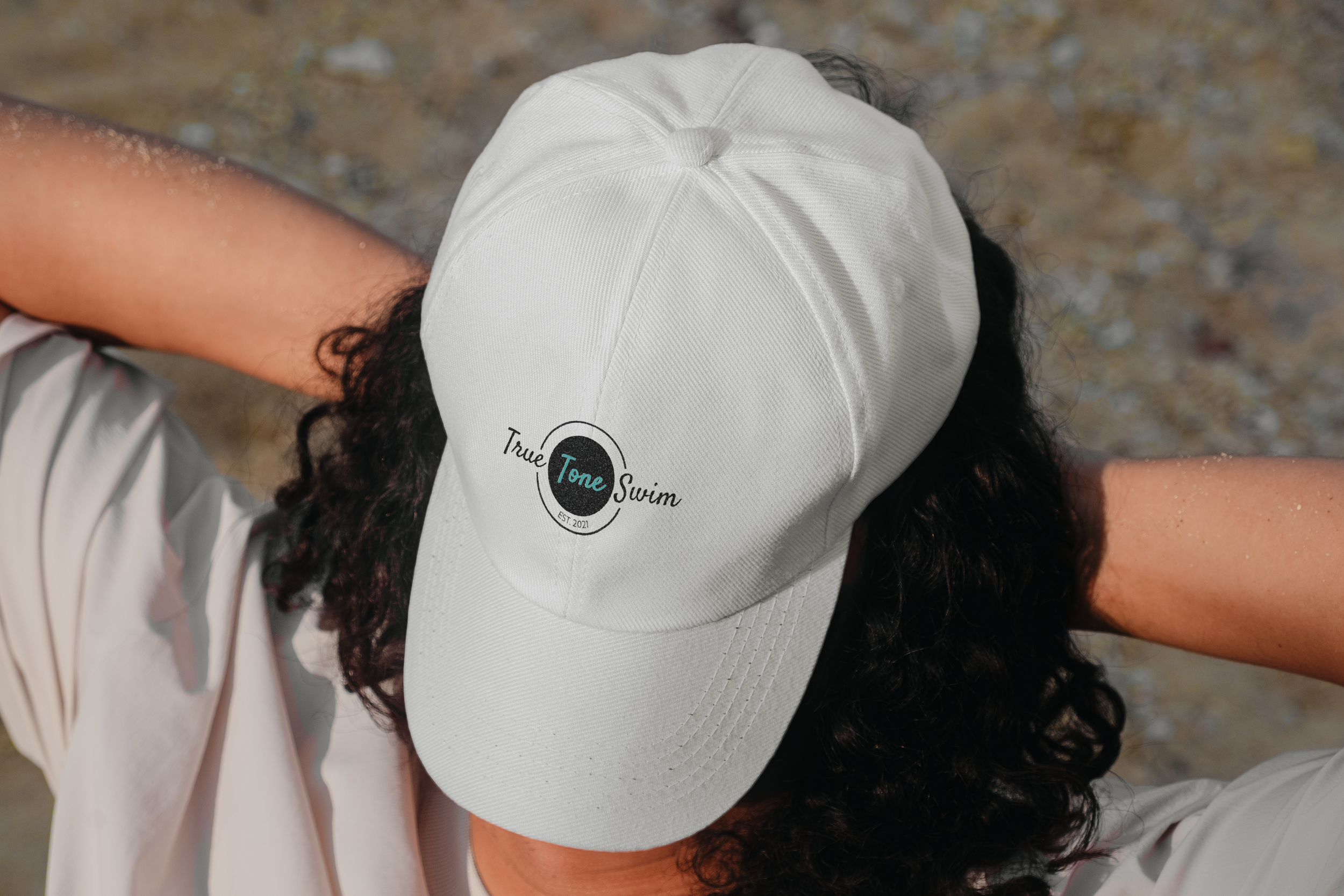
Environmental Contact