Digital Fatigue
Poster Triptych | Digital
2025
Adobe Illustrator
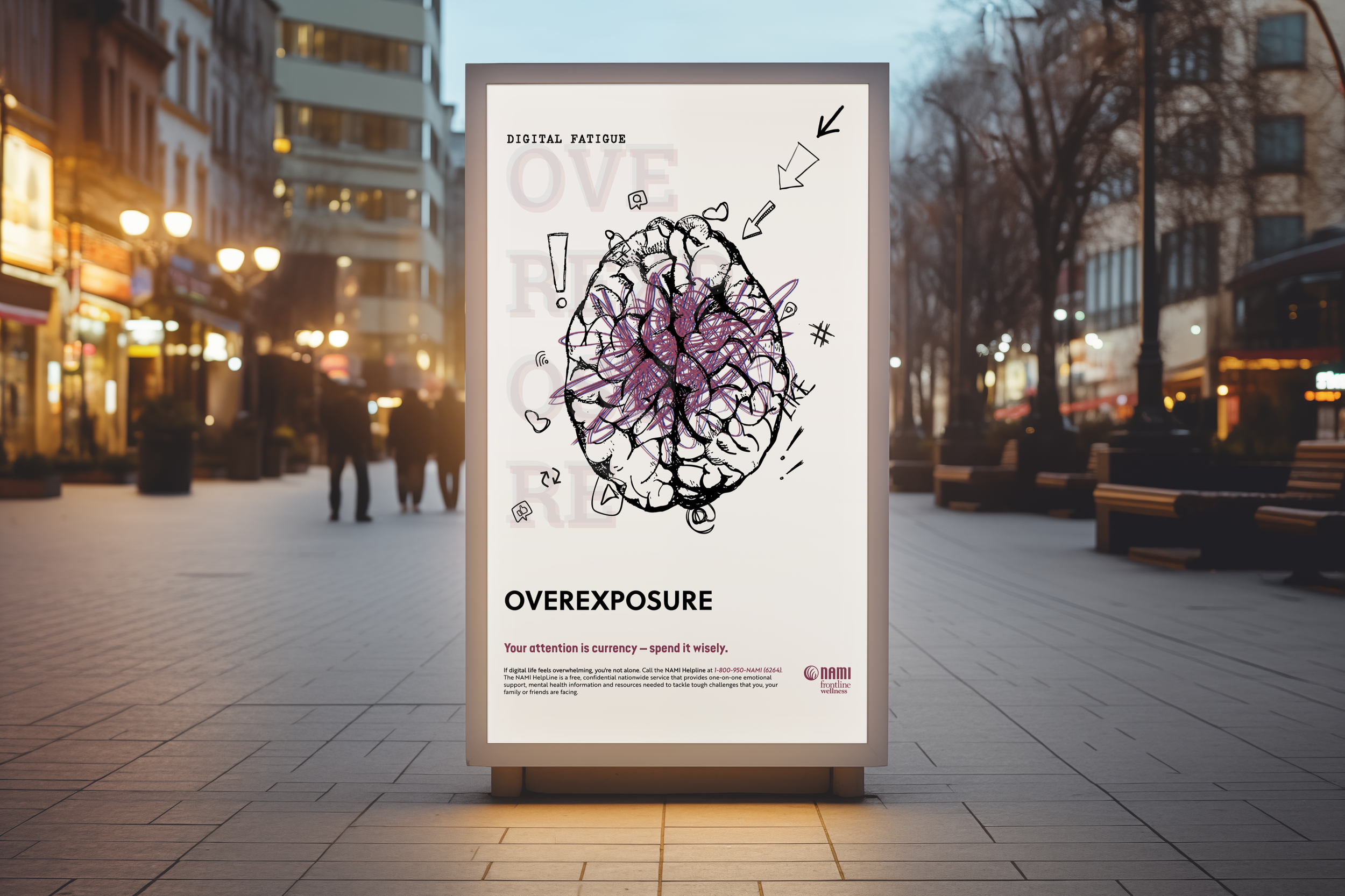
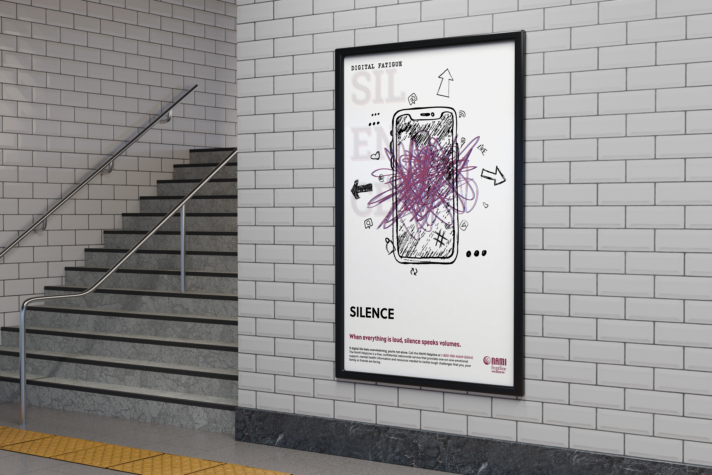
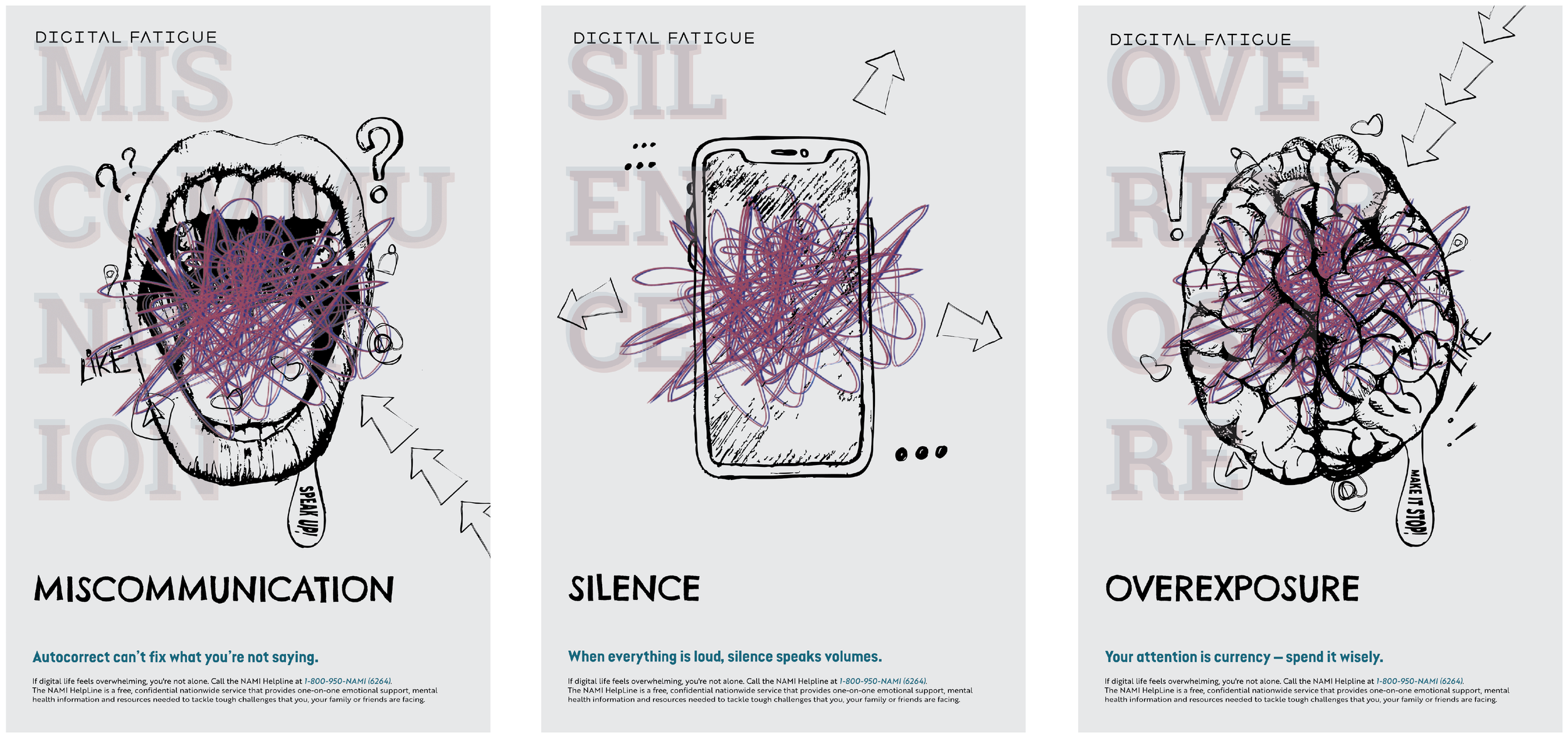
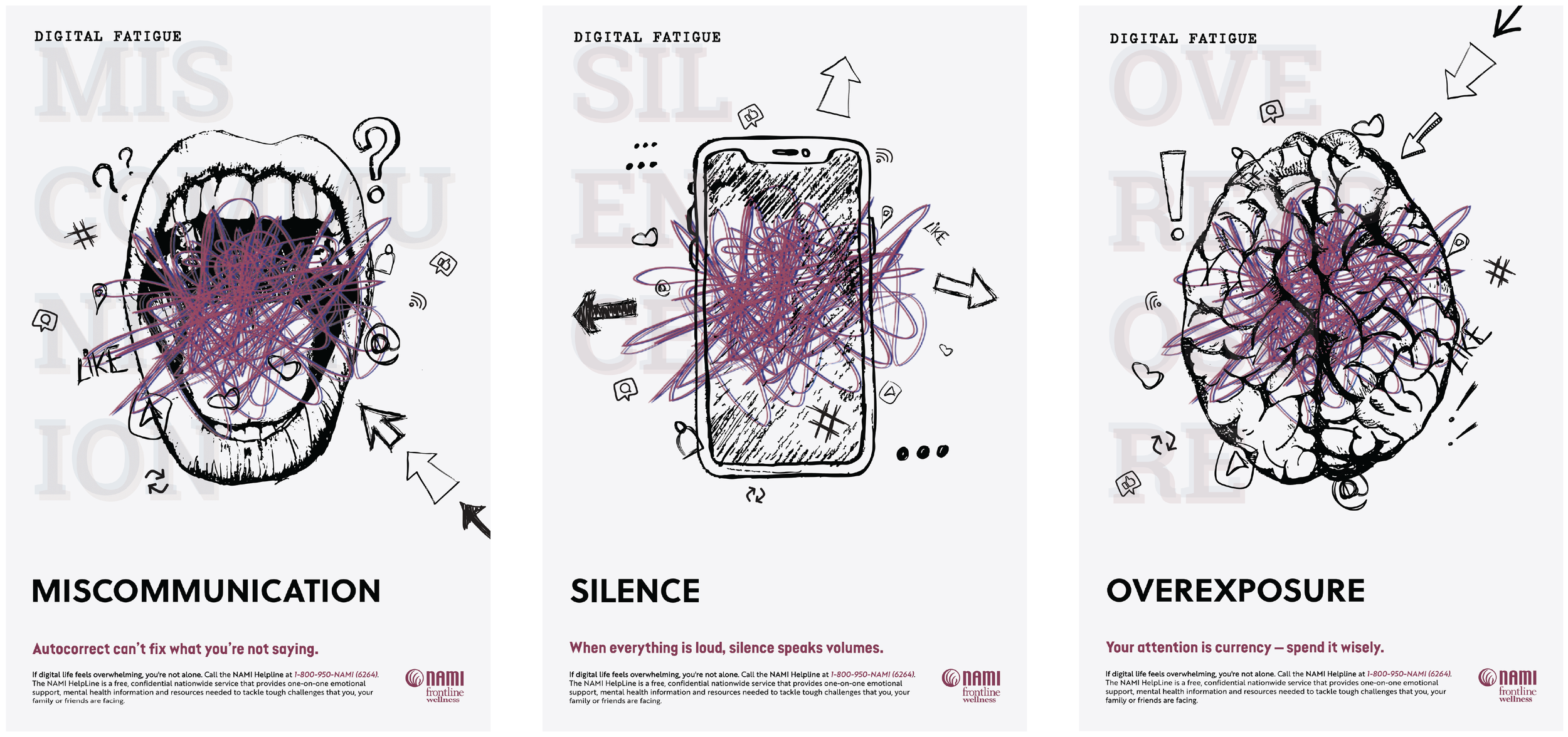
Digital fatigue, something that comes with the rise and consistent development of the digital age we are currently present in. Developing this poster triptych was a really personal and reflective process for me. This concept is something I think a lot of us experience but don’t always have the language to explain. I broke it down into three key issues I see as part of that larger struggle: miscommunication, silence, and overexposure. Each one represents a different side of how overwhelming our relationship with technology can be, especially in a time where we’re constantly online, texting, posting, and scrolling.
Pencil Meets Paper
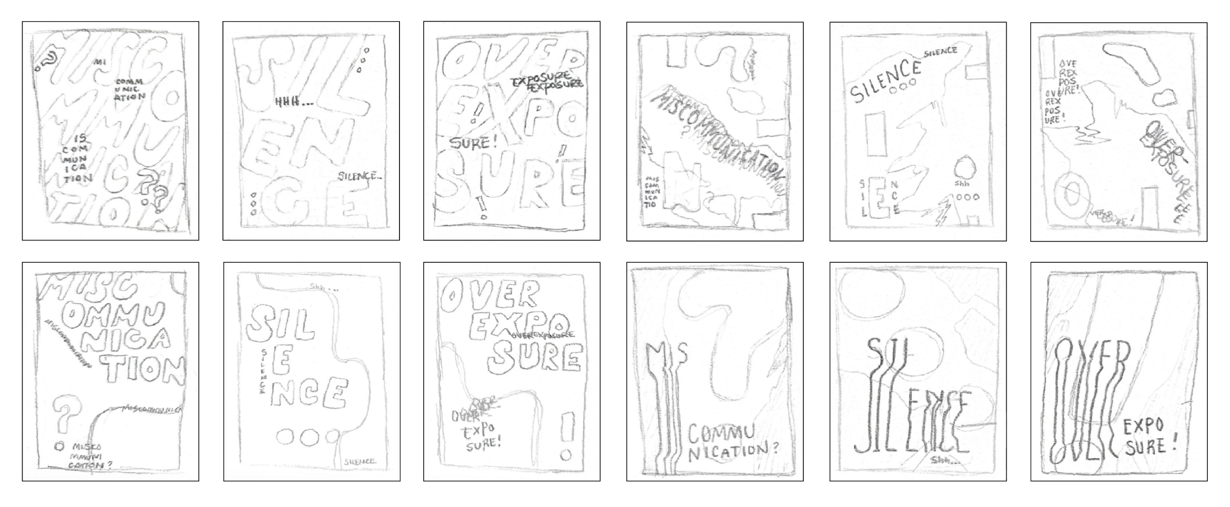
These initial sketches lay the foundation for my poster triptych, which explores the theme of communication breakdown in the digital age. Each poster represents a different facet of digital disconnect (miscommunication, silence, and overexposure) through distinct visual approaches. The sketches capture early ideas for glitched typography, fragmented speech bubbles, ghosted letterforms, and overwhelming layering. While still rough, the concepts reflect my intention to merge experimental layout, grunge aesthetics, and emotional depth to provoke thought about how technology alters our interactions.
The Letterform Palette
The typography in this project was carefully chosen to support both structure and emotional tone. Roboto Slab Bold appears oversized and faded in the background, adding subtle texture and reinforcing underlying messages. Soleil Bold serves as the clean, modern voice for main headings, while Secret Service Typewriter repeats “Digital Fatigue” with a raw, analog feel that nods to surveillance and digital noise. The Call-to-Action uses Zedou Bold, a geometric typeface that adds clarity and urgency. Together, these choices reflect the fractured, layered nature of communication in the digital age.

Color Chemistry
The color palette for Digital Fatigue was chosen to reflect the emotional tension and psychological weight of digital overstimulation. Deep violet introduces a moody, introspective tone, while rich navy adds a cool, cerebral contrast. Black grounds the compositions with a sense of heaviness and disruption, while the light gray offers brief moments of clarity and contrast. Together, these colors create a restrained but impactful palette that supports the triptych’s themes of miscommunication, silence, and overexposure in the digital age.

Form Takes Shape
My first round of digital drafts marked a major transition from sketch to screen. I digitized all of my physical sketches in Illustrator, using them as a loose foundation, but many of the original visual elements changed drastically in the process. At this stage, typography was minimal and still in flux. I wasn’t fully satisfied with the type placements yet, and the compositions lacked a clear call-to-action element. The focus was more on exploring layout, form, and visual tone, which opened up new directions for refinement in future drafts.
Polish & Progress
In the refined digital drafts, the posters began to take fuller shape as I reintroduced and enhanced sketch elements to add texture, meaning, and depth. I solidified the typographic hierarchy and added the Call-to-Action, NAMI, grounding the work in a real-world cause. These versions show a stronger alignment between concept and execution, with more intentional layering, bolder contrasts, and a clearer emotional tone across the triptych.


Final Execution
In the final designs, I focused on enhancing contrast and cohesion across the series. I switched to a lighter gray background to create stronger visual separation between the layout and the sketched elements, allowing those hand-drawn textures to stand out more prominently. I also thickened the strokes of the sketch elements for greater clarity and presence. To balance the composition, I reduced the opacity of the large background type, letting it serve as a subtle textural layer rather than a competing focal point. These final adjustments brought clarity, depth, and harmony to the posters. This tied the message and visuals together with more intention and polish.
Environmental Contact