More Than a Mask
Postage Stamp Series | Digital Illustration
2022
Adobe Illustrator
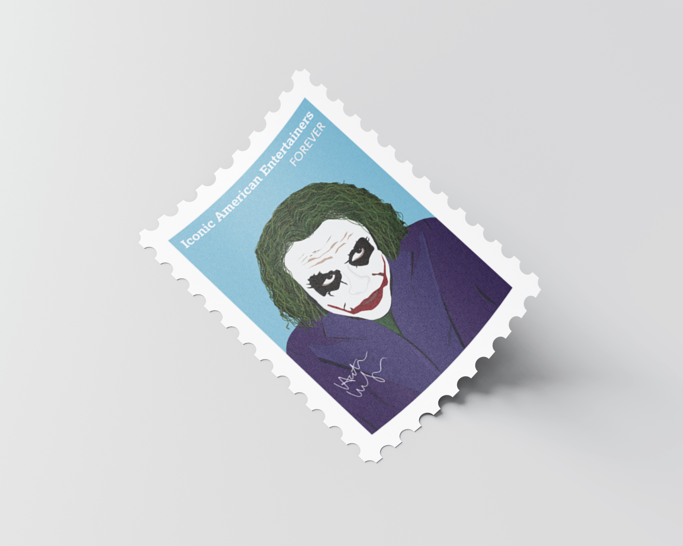
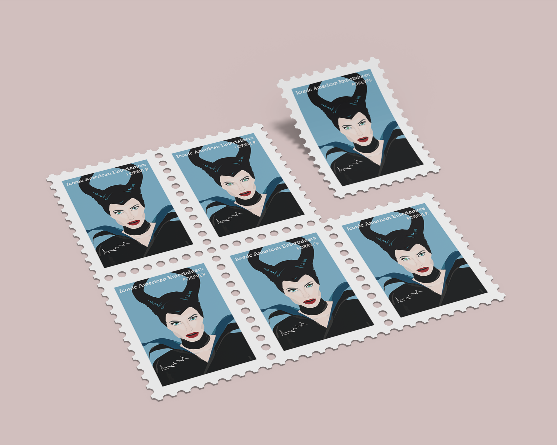
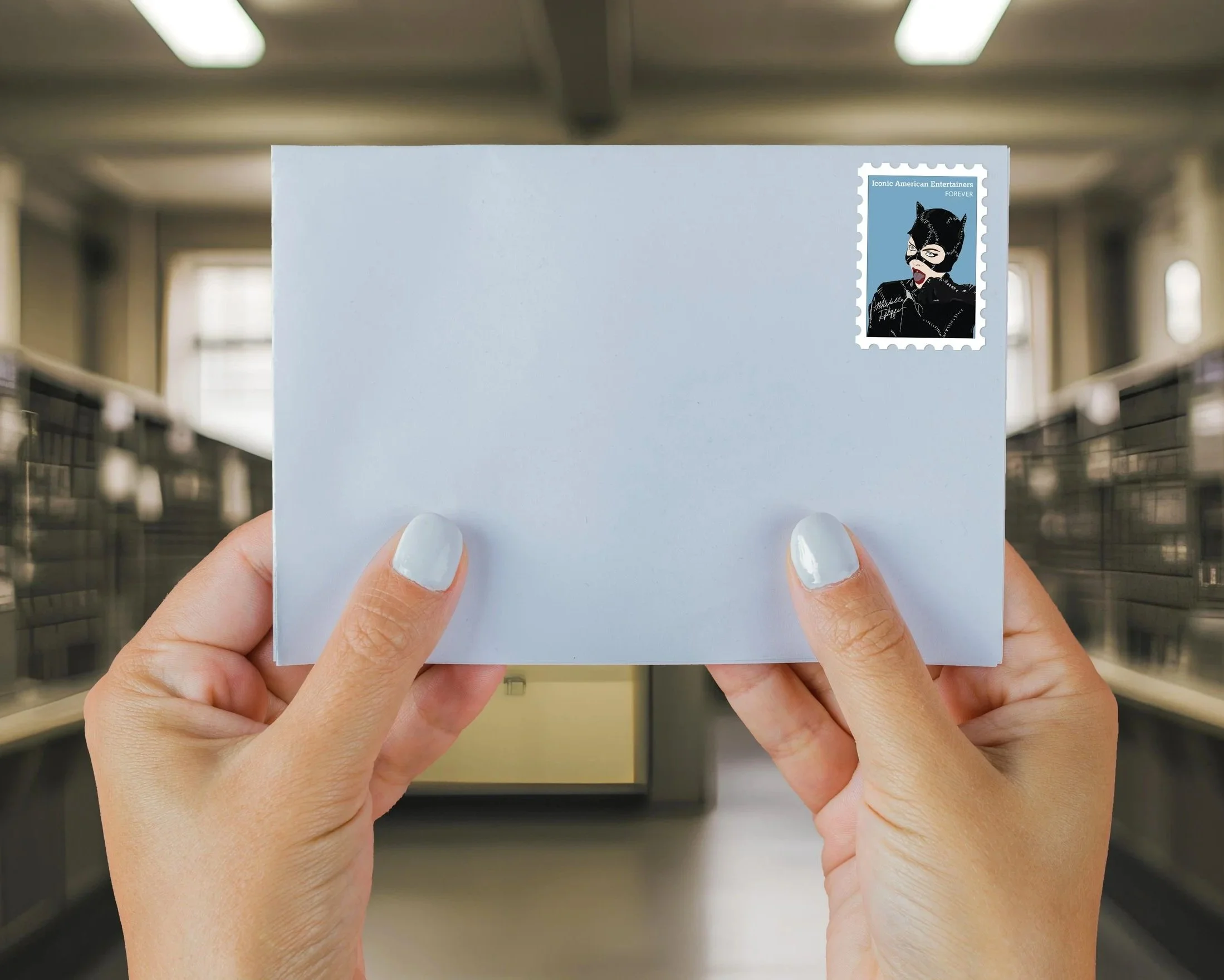
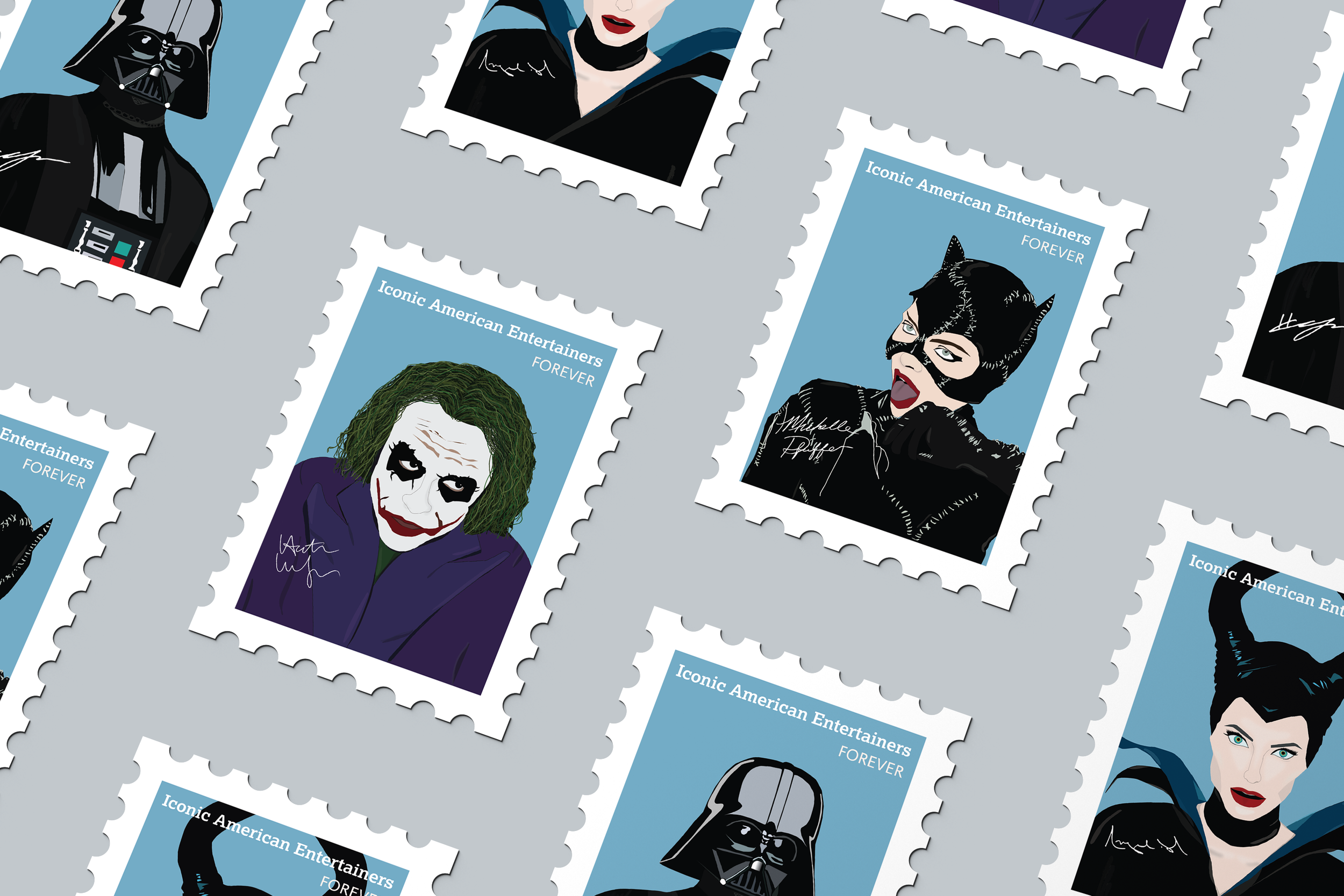
This stamp series explores the intricate, multifaceted identities of four iconic cinematic villains: Darth Vader, the Joker, Catwoman, and Maleficent. Often reduced to one-dimensional antagonists, these characters reveal layers of depth, internal conflict, and even glimpses of redemption when viewed more closely. More Than a Mask captures the emotional duality behind their dark exteriors of underlying pain, vulnerability, and humanity. By merging graphic design with narrative, the project offers a more compassionate, nuanced perspective on villainy. This concept was brought to life through the unexpected and symbolic medium of postage stamps.
Visual Direction
The visual direction began with research into the cultural impact and character development of iconic film villains who embody moral complexity. I focused on Anakin Skywalker, the Joker, Catwoman, and Maleficent. These characters are known, not just for their darkness, but for their internal conflict and moments of redemption. This informed the decision to portray each figure with a stylized yet emotionally expressive vector illustration.

The Scribble Stage
At the sketching stage, I explored composition, symbolism, and typography to visually convey the emotional duality of each villain. I created a series of rough thumbnail sketches to experiment with mask motifs and narrative-driven layouts that balance menace with humanity. These initial drawings allowed me to iterate quickly, refine concepts, and establish a cohesive visual language across the series before moving into digital design.

Digital Explorations
In the early stages, I explored a split portrait of Anakin Skywalker and Darth Vader to reflect his transformation. While compelling, it didn’t align with the rest of the series, as I couldn’t create similar dual identities for the other villains. The concept felt inconsistent and visually out of place, so I revised the design to focus solely on Darth Vader by using color and expression to convey his inner conflict in a way that fit the overall narrative.
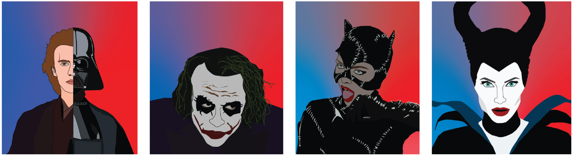
First Edition
The original stamp designs featured bold red and blue gradients that, while visually striking, often overpowered the illustrations. The portraits felt dull, and the lack of alignment across eyelines disrupted the visual flow of the series. Though expressive, the designs lacked cohesion and clarity.

Letter Logic
The title "Iconic American Entertainers" is set in a slab-serif typeface to evoke a sense of timelessness and cultural heritage, drawing inspiration from the typographic traditions of classic U.S. postage stamps. The weight and structure of the slab serifs ground the design, reflecting the enduring impact of these characters in entertainment history. To contrast this, "Forever" is presented in a clean, modern sans-serif, referencing the contemporary aesthetics of current USPS stamp design while reinforcing the notion of lasting cultural relevance. This intentional pairing of type styles enhances the visual hierarchy and supports the conceptual framework of bridging legacy with modern interpretation.

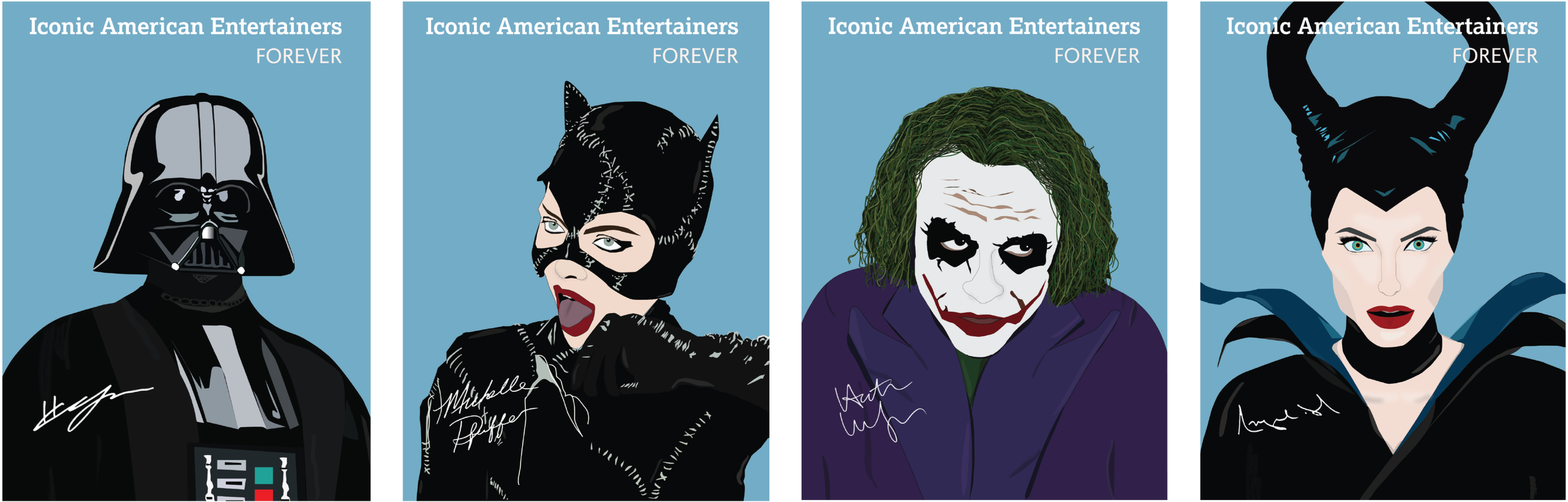
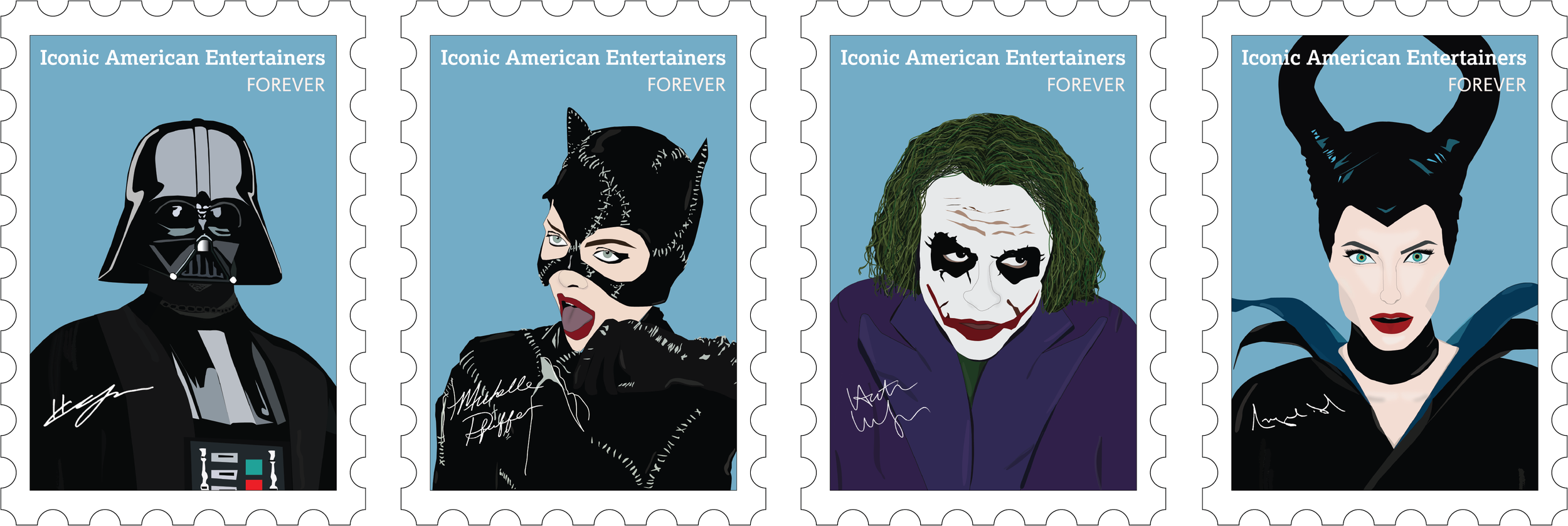
Priority Polish
In the final rework phase, I replaced the heavy red and blue gradients with a solid muted blue background to improve clarity and contrast. This shift gave the portraits more vibrancy and allowed their facial expressions and details to stand out. Aligning the eyelines across the series added visual harmony and strengthened the emotional impact.
Second Edition
The final designs include intentional typographic choices and personal touches to strengthen the visual narrative. “Iconic American Entertainers” is set in a serif typeface to give the title a classic, commemorative feel, while “forever” appears in a script font reminiscent of traditional postage stamps. To further individualize each piece, I added the actual signatures of each character, introducing a layer of authenticity and recognition. These thoughtful details brought cohesion, character, and a refined finish to the overall series.
Environmental Contact