Infinite City Construction Co. Rebrand
Completed Rebrand | Digital
2025-26
Adobe Illustrator, Adobe Photoshop
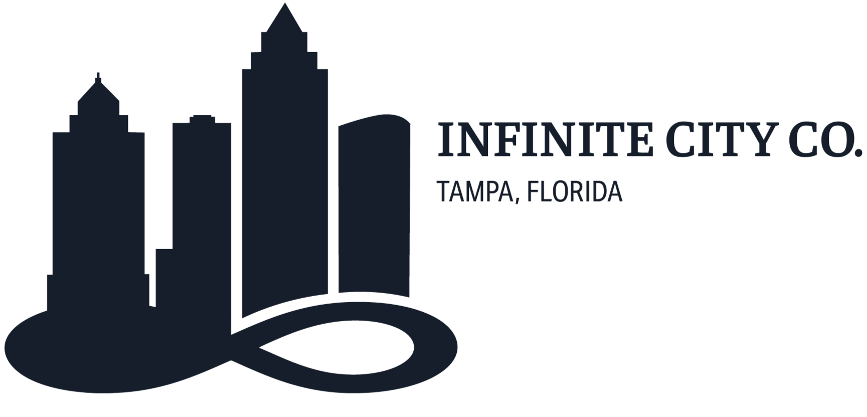
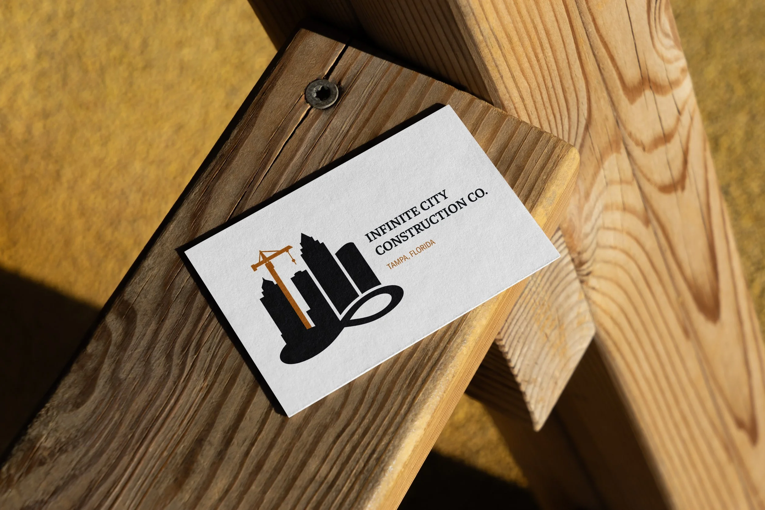
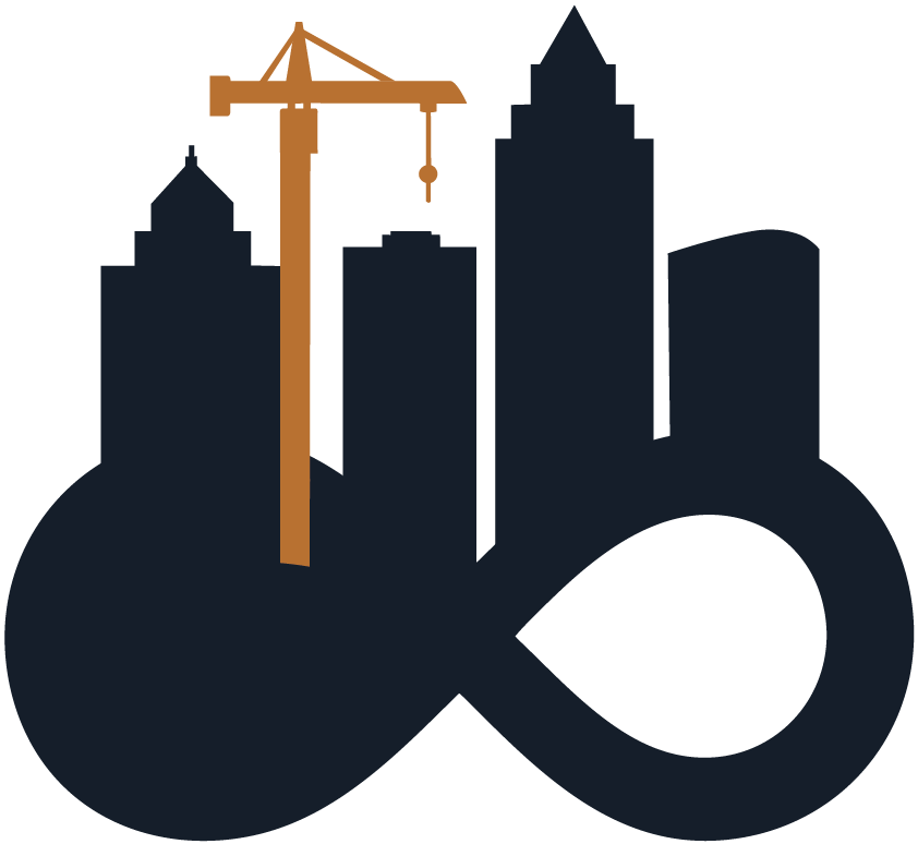
This project delivers a modern brand transformation for Infinite City Co., a Tampa-based company specializing in construction, landscaping, and restoration. The rebrand establishes a sleek, high-end identity anchored by this flagship construction logo, which serves as the foundation for a cohesive multi-service visual system. By pairing a clean skyline silhouette and a pop of industrial gold with a fluid infinity loop base, the design strips away the clutter of the old badge while retaining a modern nod to the company’s building roots. The result is a sophisticated, highly scalable master asset that effortlessly branches out to unify all of the company’s diverse services under one premium, forward-looking aesthetic.
Demolition Day
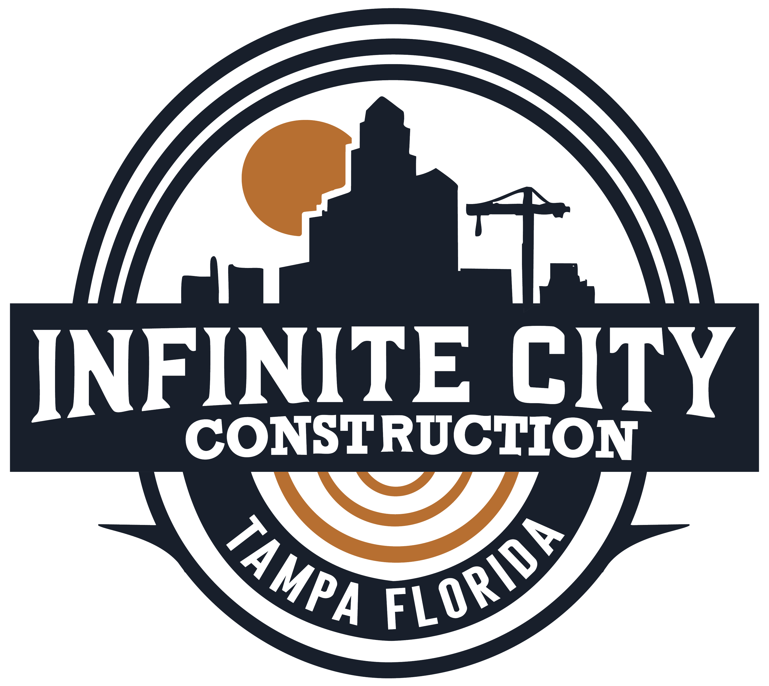
The company's legacy logo featured a traditional, asset-heavy circular badge anchored by literal construction imagery and textured typography. While it established a hardworking, grit-driven feel, the complex layout suffered from low scalability and lacked the modern sophistication required for a growing business. Because it was heavily hyper-focused on general contracting, the design ultimately boxed the brand in, making it difficult to seamlessly market their expanding landscaping and restoration sectors. This bottleneck became the direct catalyst for a total visual overhaul, priming the company to transition from a localized contractor aesthetic to a high-end property solutions authority.
The Material Selection
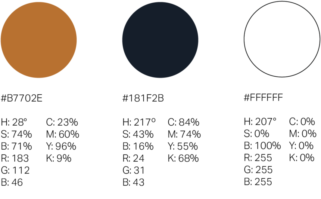
While the structural identity underwent a complete teardown, the original color palette remained an essential foundation worth preserving. Keeping the existing palette allowed the brand to maintain its local recognition in the Tampa area while grounding the new, modern design in familiar territory. The deep, industrial slate serves as a heavy, authoritative base, while the vibrant, structural gold injects a pop of high-contrast energy. By recontextualizing these colors within the clean lines of the new layout, the palette shifts from looking standard and gritty to feeling premium, intentional, and polished.
Structural Framing
The typography serves as the core framework of the identity, striking a deliberate balance between rugged reliability and modern sophistication. I chose to preserve the original spirit of the brand by utilizing a thick, impactful serif typeface for the primary "Infinite City" wordmark. This heavy type choice acts as a visual anchor, giving the company name a sense of permanent, structural weight. To contrast this bold foundation, the subhead is set in a clean, high-contrast sans-serif. This pairing creates an immediate typographic hierarchy, ensuring that while the primary name commands attention with a nod to its hardworking roots, the secondary details keep the overall layout feeling open, balanced, and premium.



The Blueprint Stage
With the old badge cleared away, the focus shifted to drafting a scalable visual blueprint. I was determined from the start to integrate three specific pillars into the core identity: the skyline, the construction crane, and the infinity symbol. However, early iterations felt disjointed. The elements were fighting for dominance rather than working together, and the layout wasn't quite sitting right just yet. The breakthrough came by refining the hierarchy: locking in a minimalist skyline silhouette to ground the design, resting it upon a fluid infinity loop base to symbolize endless growth, and introducing a single, structural crane in industrial gold as a high-contrast focal point. By pushing through that awkward middle phase and pairing these resolved elements with sharp, modern typography, the pieces finally clicked into place.
The Final Handover
The company's legacy logo featured a traditional, asset-heavy circular badge anchored by literal construction imagery and textured typography. While it established a hardworking, grit-driven feel, the complex layout suffered from low scalability and lacked the modern sophistication required for a growing business. Because it was heavily hyper-focused on general contracting, the design ultimately boxed the brand in, making it difficult to seamlessly market their expanding landscaping and restoration sectors. This bottleneck became the direct catalyst for a total visual overhaul, priming the company to transition from a localized contractor aesthetic to a high-end property solutions authority.

Zoning for Expansion
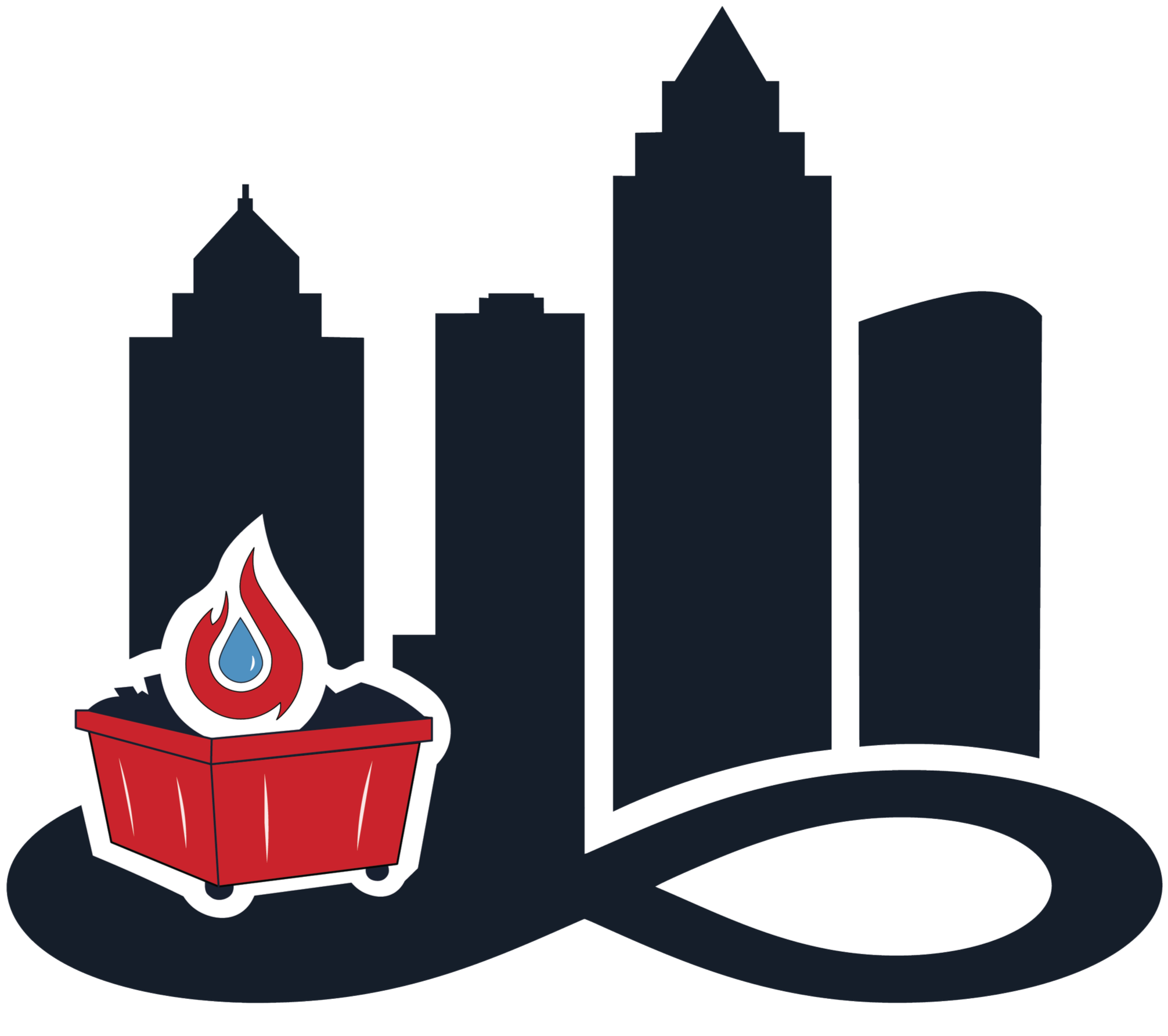
A truly successful brand asset doesn't just look good in isolation, it builds room for a full ecosystem. Using the flagship construction logo as the anchor blueprint, I expanded the visual system to seamlessly welcome two brother branches: Infinite Cityscapes and Infinite City Restoration. By keeping the core foundation of the skyline and the infinity loop completely intact, the system maintains ironclad brand consistency while effortlessly shifting focus. The landscaping extension swaps the industrial crane for a vibrant green palm tree and rolling terrain, perfectly fitting the Tampa environment, while the restoration logo introduces a high-contrast red dumpster, flame, and water droplet element. This smart modularity proves the new identity is highly scalable, allowing Infinite City Co. to effortlessly pivot across distinct industries without ever losing their unified brand authority.

The Master Plan
With the specialized branch logos successfully framed out, the entire project culminates in the corporate master mark: Infinite City Co. Dropping "Construction" from the primary name marks a massive strategic shift, transitioning the brand from a single-industry contractor to a comprehensive multi-service powerhouse. For this flagship logo, the industrial crane is completely cleared away, leaving the pristine skyline silhouette resting atop the infinity loop. This pure, minimalist execution creates the ultimate corporate umbrella; a sleek and timeless asset that anchors the parent company while beautifully unifying their specialized construction, landscaping, and restoration teams under one sophisticated visual identity.